One of the biggest challenges most people my age face fresh out of college may be one that many still in college are all too familiar with - a tight food budget. With rent, going out, credit card payments, going out, utilities, going out, and oh yeah, going out, the amount we have for food isn't always as generous as we may hope. Cheap ramen was a staple for many at school and for many continues to be to this day. That being said, we need to care for our bodies by eating nutritious food. Luckily, nutritious and budget friendly are not mutually exclusive qualities. Many foods will leave you full and give you your daily recommended values all while not breaking the bank - But not all foods are created equal. After collecting price and nutrition data for a variety of grains, fruits, vegetables, and more, I tried to make a tool to help people see what foods would best suit their needs. Thus this article, and a little tool called the Food Data Visualizer were born. What is this thing? Read on, find out, and download it yourself to play around with it.
For full disclosure, this post is not meant to be a nutritional guidebook. I am not a registered dietician nor do I claim to be a nutritional expert in any way, shape, or form. I'm just a guy who loves eating, occasionally enjoys playing around with data, and also recognizes that sometimes we need to balance eating well with eating healthy. With this in mind, this post and the downloadable food data visualizer are meant to help people who are and have been in a similar situation to me-people who want help in figuring out what I should be eating to match my dietary goals.
Alright you statisticians and science majors, I have a confession to make: My methods are not perfect. I combine multiple data sources to find data for a single set of information and even pulled from my own personal observations in a region which may not be reflective of the general population. Some of my guides were even subjective in nature. Sue me.
For the purposes of this post, I tried to find a way to get as recent and accurate data as possible. For the nutrition scores, I borrowed a system from: http://nutritiondata.self.com/
This site provides their own methodology to determine nutrition on two main dimensions - caloric density, aka how calorie dense a food is per serving (double aka "richness" basically), and nutritional punch, aka how many key nutrients, vitamins, and minerals a food has. These scores are aggregated into a score between 0 and 5, with 5 being the highest and best score. The specific methodology of how they get these scores can befound here.
I used these scores as they take into account a number of nutrients as well as give a score on how calorically dense a food is. The less rich a food is, the more of it you can eat for a particular serving. In the site's lingo, they call this "fullness" as you can eat more and still maintain a reasonable amount of calories and stay fuller, longer due to the volume of food. The less rich a food is, the higher it scores.
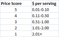
On the pricing side, I tried to get a much data as possible from recent government survey data. For this, I turned to the Economic Research Service (ERS) of the US Department of Agriculture (USDA). They provided a large portion of the price data I was able to find broken all the way down to average US prices per standard serving. For those instances it was not down to the serving, I broke down the unit price they did provide into the standard serving size for that food. In cases where the ERS did not have price data, I looked to average price data on other reputable sites as well as everyday prices at the local American grocery megamarts here in the suburbs of Northern Virginia. The prices per serving where then scored based on price. Where did I get these scores? A quick survey of friends of course (Ha! Science!). Here is the scoring:
Sound confusing? Well thankfully, it can be summed up in one sentence: This tool helps guide you to which foods would be best for you to buy and eat given your preferences of nutrition and budget.
Data in tables may be fun and desirable for some people like myself so like seeing rows and columns of numbers, but for some many people who just hate excel, the easiest way to see how well foods stack up is in a simple graph. Whichever team you fall into, both forms, a table and graph, are available. The graphs will even automatically adjust in response to your changes Fancy, eh?
Well, there were some expected findings and some very unexpected findings as well. While I will save the bulk of the results and data for the downloadable Food Data Visualizer below, I will use an analysis of a variety of Fruits as an example.
For my default, I set all of my preferences at baseline - so I equally valued caloric and nutritional density when looking at overall nutrition, and I equally valued overall nutrition and price. My settings looked like this:
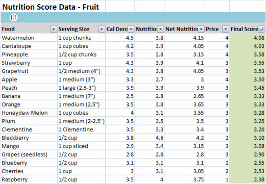
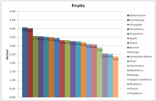
With these settings in place, I was able to get the following table and graph, giving me an overall score for the fruits I included in this survey.
With everything set equally, Watermelon and Cantaloupe are the highest scoring fruits by a pretty wide margin. If we check out the table, we can see how they fought their way to the top - both are cheap per serving and are very respectable in their overall nutrition scores, being both rich in nutrients and also not being overly dense in calories, meaning you can eat more and feel more full without packing on extra weight.
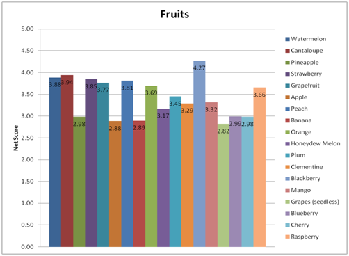
But wait, what if we change things up a bit? What if instead of valuing everything equally, money is no object and you just want to get our nutrient fix? (Swimsuit season is coming up and you did say "New Year, New Me" back in January) Well, then the graph looks a bit different.
Some other surprises which lie in the data and can be found in the Food Data Workbook are the following:
- Avocados are not as great for you as you may think
- Some of the cheapest grain options are actually some of the best for you
- The best protein for you is probably not actually meat
- Ramen is actually pretty healthy for you! (Kidding...it's definitely not)
By weighing nutrition more heavily versus cost and caloric density, the landscape is very different versus when you valued everything equally. And the best part is, the results can and will constantly change depending on how you adjust the variables. The usefulness of this tool is to help you easily see what foods would best suit your needs. Below is the download link for the Food Data Visualizer for you to play around with. Each tab covers a different set of foods - Grains, Vegetables, Fruits, and Protein. Each includes some of the most popular and widely available foods at most American grocery stores. There is also a tab which brings all the graphs together onto a single page to quickly see everything at a glance.
| Food Data Visualizer |
Let me know what you think and suggest any recommendation to improve the tool in the comments below!


